


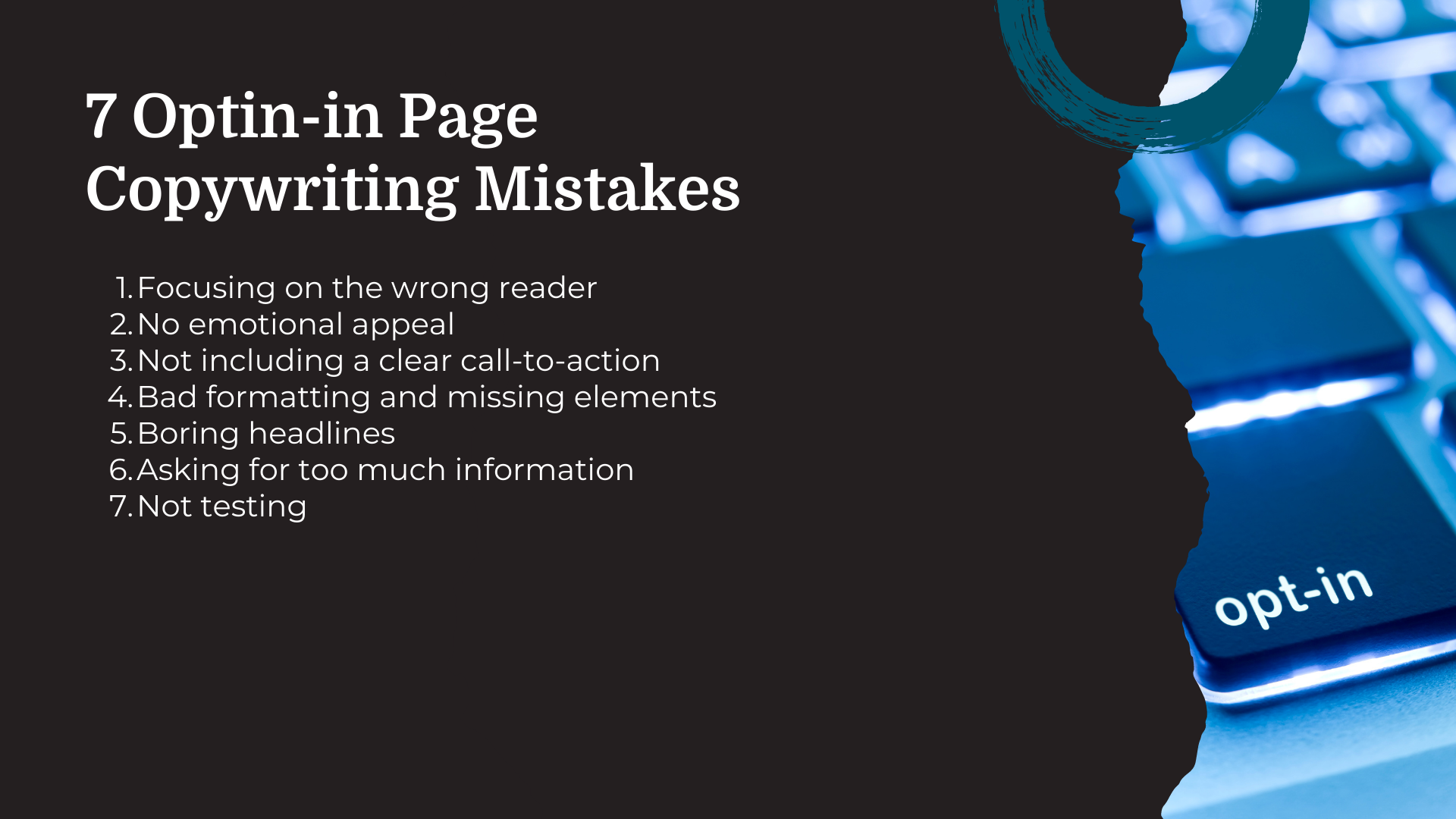
7 Opt-in Page Copywriting Mistakes & How to Fix Them
Are you making these opt-in page copywriting mistakes?
Tell me if this sounds familiar:
You spend entirely too much time creating an opt-in page that not only looks great but that provides all the information anyone could ever possibly want to know about why they should opt-in to whatever it is that you’re offering.
You publish the page. You run ads to it. You get lots of traffic.
And no conversions.
Why?
There are a number of reasons folks might not be converting on your opt-in page. Here, I’m going to share the 9 most common opt-in page copywriting mistakes I’ve seen — and how to fix them!
Oh wow, another passive aggressive popup.
I’m actually a fan of popups.
Not the annoying ones, of course. But I really dig popups that are engaging and well-designed. And well-planned out.
What I don’t love are popups that flash in my face at nearly the exact same moment I land on a page.

Like, I just got here. I don’t know you, what you’re about, or if I even like you. Why are you asking me to sign up for anything? Even if you’re offering me a discount.
I also don’t love popups that make me feel like I’m somehow wrong for not opting in. Here are a couple examples of what I’m talking about:
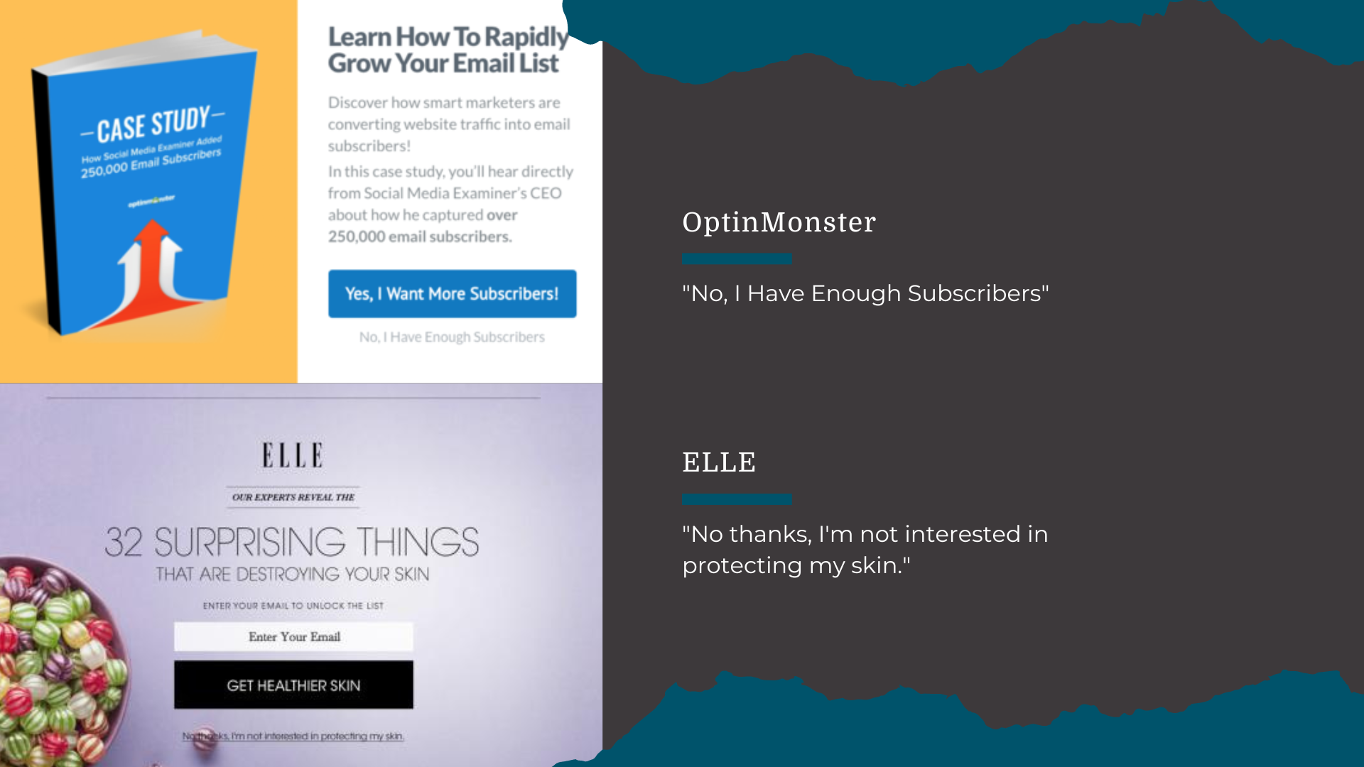
OptinMonster offers a case study lead magnet with the opt-in button text of “Yes, I Want More Subscribers!” and opt-out text of “No, I Have Enough Subscribers.”
Elle offers a list lead magnet with the opt-in button text of “get healthier skin” and the opt-out text of “No thanks, I’m not interested in protecting my skin.”
The implication is that by opting out of these offers, you are somehow flawed or wrong. But when you have an opt-in that people want, you don’t need to use these tactics.
But opt-in page mistakes go beyond creating popups that aren’t convincing. So, let’s dive into more of the most common opt-in page copywriting mistakes I’ve seen.
Common opt-in page copywriting mistakes
Here are the opt-in page copywriting mistakes I see most often when I’m cruising around the internets. Aaaaaand, how you can fix them.
1. Focusing on the Wrong Reader
Probably the most common mistake people make is not writing to the right person or trying to write to multiple different people.
I’m here to tell you that not everyone is your audience. Not everyone wants to hear what you have to say. Not everyone cares.
In fact, most people don’t.
Hard truths.
So, take the time to find your audience. Jo from Copyhackers calls this your “one reader.”
And then write to them.
How to fix it:
Find your one reader. This is the person who is going to get the most benefit from your offer, products, services, whatever.
You’ll find your one reader through market research, competitor research, voice of customer research — pretty much any research.
Then, once you find them, you’ll want to identify where they are in your sales funnel to find out how to create the content they need in order to build a solid relationship with them and, hopefully, nurture them to the next stage of awareness.
2. No Emotion
Your marketing needs emotion. And not just the sunshine and puppies kind.
There’s this idea that highlighting any emotion other than happiness and contentment is somehow using intimidation or fear-based tactics.
But that’s not how human emotions work.
As humans, we experience a broad range of emotions. Some feel nice, some don’t feel so nice.
But none of them are bad or negative. They just are.
Not to get all deep and philosophical but here we are.
Including emotion on your landing page might mean commiserating with your audience about one of the pain points that brought them to you.
The purpose isn’t to make them feel bad or wrong or like buying your product is the only way they’ll improve their life.
The purpose is to let them know that you understand where they’re coming from.
How to fix it:
Put yourself in the shoes of your one reader. What is it that brought them to you? There’s something about their experience that they’re not content with.
Let them know you understand.
Let them know that you hear them.
And let them know that they’re not alone, they’re not bad for feeling this way.
Then, coach them through it.
Yes to coming from a place of understanding and coaching readers to a conversion.
No to tearing down readers and making them feel bad. And please, for the love of all things, no false urgency or scarcity.
3. Not Including a Clear Call-to-Action
When putting together your opt-in page, think about what you want readers to do. What action do you want them to take?
Once you decide, everything you include on that page should lead the reader to taking that action.
Everything you add to your page — navigation, sidebars, ads — are distractions that will take your reader out of the journey.
How to fix it:
I already mentioned this, but keep your messaging focused on a single action you want your reader to take from the opt-in page, like signing up for your email list by downloading your super cool lead magnet.
Get rid of the sidebar and navigation links.
Don’t link out to anything else.
Make the action clear
Use an easy-to-read font of at least 16px
Use a color that makes your call-to-action stand out
4. Bad Formatting and Missing Elements
We’ve all landed on a page and been like
The format is wrong, there’s too much to look at, not enough information, no way to actually do anything… In a word, it’s a mess.
Don’t do that to your readers.
Help them, help you.
How to fix it:
Here’s all you need on your opt-in form:
A catchy headline that speaks directly to your one reader
Copy that highlights the benefits — not the features and advantages. Really get to the heart of the question “so what?”
A call-to-action that explicitly states what you want your reader to do. Don’t be so clever and cute that your reader is confused about what will happen when they click the button.
An opt-in form. This should go without saying, but you need a way to collect contact info from the reader.
Social proof that shows your reader how taking action will has helped others. This is optional. You might not need it, but it’s probably not going to hurt.
In addition, you’ll want to include some nice, high-quality images or a video. Walls of text are a big no.
And, as I said before, it has to be readable. Images and videos break up walls of text and make things hit the eye a bit nicer.
Also, include subheadings, bullet points, and varying text sizes (no smaller than 16px) to draw attention to specific points.
5. Boring Headlines
You’ve probably heard that only 20% of people read beyond headlines, right?
The bad news: it tracks.
The good news: if your headlines don’t suck, there’s a better chance folks will keep reading.
So, say goodbye to boring “My Essay on Why You Should Opt-In” headlines if you want people to actually, um, do things.
How to fix it:
Your headlines should be catchy. You’ll likely hear that they should also be short, but if it’s a good headline, again, folks will keep reading.
My recommendation is to turn your number one benefit into your headline. Lots of times, you’ll see something like this:

When it should actually be like this:

Lead with what your readers care about. And it ain’t your company name.
6. Asking for Too Much Information
Your opt-in forms should be as short as possible. Long forms are not only hard to fill out on mobile devices, but your free checklist doesn’t seem nearly as interesting if you’re wanting more than just name and email address.
Are there times you’ll want a longer form?
Sure.
You might want to build a list only of the most high-qualified leads. In that case, you’ll probably want to include some questions that will help you segment based on those things that signal who those people are in your list.
But if you’re just trying to build an email list full of folks interested in what you do, stick to the basics.
How to fix it:
Keep your opt-in form limited to the minimum information you need. Honestly, name and email are usually perfect for future marketing needs.
If you want, you can use some kind of progressive profiling that will ask returning visitors who are already in your email list to answer additional questions to build out your subscriber profiles.
7. Not Testing
Okay, okay. This isn’t technically an opt-in page copywriting mistake. But it’s important.
Without testing, you can never really be sure if your opt-in page is converting as well as it could be.
My advice is to find a landing page tool that offers A/B testing capabilities. I used to use LeadPages (and still recommend it without reservations), but these days I'm loving Funnel Gorgeous.
How to fix it:
Test! Test everything! Headlines, calls-to-action, button colors, images, your offer — all the things.
What can a well-written opt-in page do for your business?
So, what’s the verdict? Are you guilty of any of these opt-in page copywriting mistakes?
If the answer’s “yes,” don’t stress. The tips I’ve included here are going to go a long way toward helping you fix those mistakes so your opt-in pages can get back to doing work for you.
Of course, these aren’t the only opt-in page copywriting mistakes that can be made (we haven’t even talked about how long a page should be) but they’re definitely the more common ones.
Would you rather not have to deal with any of it?
That can be arranged.
As your friendly neighborhood marketing consulting, I’m ready, willing, and able to whip those opt-in pages into shape. Let’s talk!
Nothing in on this page or any other site or communication by or from me is a promise of earnings or guarantee of results.
