

User Experience: 10 Things Visitors Hate About Your Website
User experience plays an increasingly large role in not only how visitors to your site perceive your brand, but how search engines like Google decide where your site’s going to show up in the rankings.
Bad user experience makes it harder for visitors to your site to get answers to the questions that brought them to your site in the first place. And that means they’re more likely to bounce and get those questions answered elsewhere. Probably one of your competitors.
A lot of the time, we hear about user experience (UX) for things like software platforms, but it applies to website design, too. When you design with UX in mind, you’re designing based on usability, making it easier for visitors to navigate your site and consume the data on it.

Bad design? I’m probably not sticking around to find out if your content’s good. #sorrynotsorry
Tell me if this sounds familiar…
You click a link and are whisked away to that magical place on the internet where your questions are sure to be answered.
The moment you land on the page, a wild popup appears!
No, thank you, brand new site I’ve never been on before. I don’t know you and don’t want to subscribe to anything just yet.
You close the popup and start reading.
Before you’ve hit the second paragraph, another popup appears.
What. In. The.
Now, if you’re anything like me, you’re already pissed. You sigh loudly at your monitor and vigorously click to close the popup.
You continue reading and start scrolling down the page to keep reading.
ARE YOU FREAKING KIDDING ME??? ANOTHER POPUP???
You rage quit the site.
And it doesn’t have to be popups. It could be anything that makes it harder than it needs to be to read what’s on the page.
If you’re going to make it hard for me, I’m going to leave.
So, how do we make it easier for people to actually get what they need from our pages? Let’s talk about it.
Poor User Experience: What Visitors Hate About Your Website & How to Fix It
“Okay, okay, Jacinda. I get it. UX is important. So, how do I do it?”
Glad you asked!
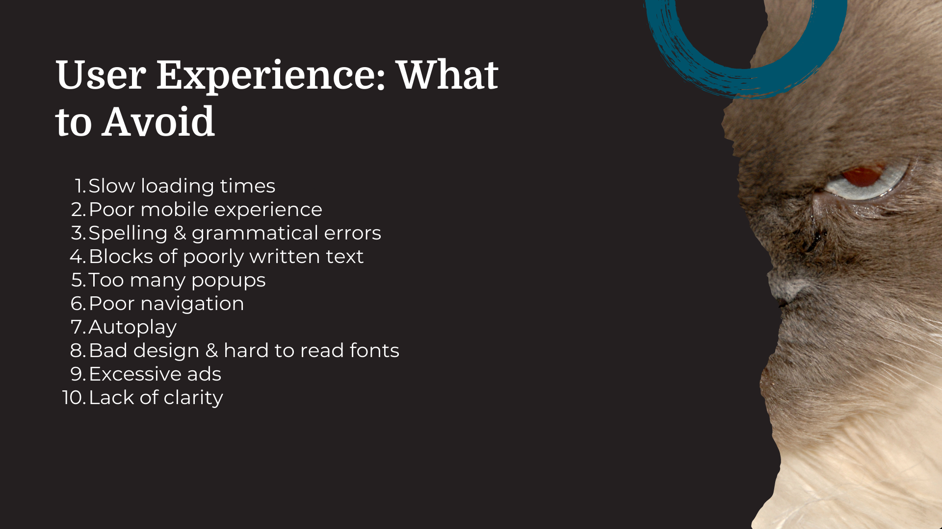
Let’s dive into 10 of the things visitors hate about your website and how you can fix them.
Get ready to take notes!
1. Your website is painfully slow
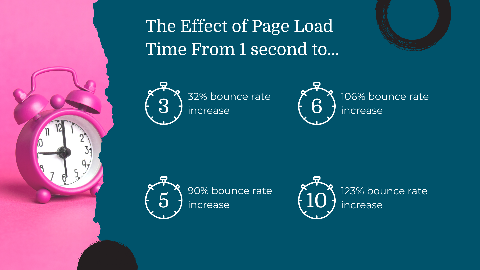
Google recommends that your website load within 2–3 seconds. In fact, a 2017 Google study found that the probability of a bounce increases by 32% as page load time increases from 1 to 3 seconds.
Yes, 2017 is basically a thousand years ago.
But when you consider that our attention spans have decreased over the years, it’s likely that the bounce probability is even greater these days.

How to fix it:
Google PageSpeed Insights is a free tool that tells you how your site’s load time measures up and gives you tips to reduce loading time. Generally, optimizing your image and video sizes and minifying CSS and JavaScript decreases load times quite a bit.
2. It looks awful on mobile devices
More than half of internet traffic happens on mobile devices. That means it’s vital for your site to look great on mobile.
Sites that aren’t mobile-optimized are hard to navigate, take too many resources, and are sometimes completely unreadable.
How to fix it:
Optimize UX using a responsive design. Responsive design creates dynamic formatting changes depending on the screen size on which your site’s being viewed.
Don’t do this as an afterthought, though. A site that looks great on mobile is designed to look great on mobile right from the start.
3. Spelling & grammatical errors abound
Even when people aren’t too concerned about spelling and grammatical errors in their personal correspondence, there’s something about seeing a business site with those errors that just makes you feel like you can’t trust the brand.
Your website is usually the first (and sometimes the ONLY) chance you get to make a good impression. If your site has tons of spelling and grammatical errors it detracts from your message.
How to fix it:
Grammarly is one of my favorite tools. Granted, Grammarly and I don’t see eye to eye all the time. I have a tendency to break grammar rules when it serves my purpose.
Still, it’s an awesome tool for those basic spelling and grammatical errors that make you look like an amateur.
ProWritingAid is another great option.
4. The Dreaded “Wall of Text” (Especially If It’s Poorly Written)
There are quite a few ways you can go wrong with the text on your page.
For starters, if the first thing your visitors see is a giant wall of text, they’re not likely to stick around.
Other content/text-related things that visitors don’t like:
Justified text. Justified text is oddly spaced and hard for users (particularly those with dyslexia) to read. Personally, I don’t even like centered text unless it’s in the center of the page and narrow enough that my eyes don’t have to travel aaaaaaallllllll the way across the screen to read it.
Keyword stuffing, Keyword stuffing means cramming your content full of keywords in effort to try to trick search engines to rank you higher. It worked, like, 20 years ago, but doesn’t work these days.
Jargon. If your copy is too niche, you’re going to miss out on a large segment of people looking for the information you’re sharing.
How to fix it:
Break up blocks of text with images, subheadings, bullet points, and more.
Avoid keyword stuffing by writing for humans first. Then optimize for search engines.
Avoid buzzwords and jargon. Clear beats clever every time. Keep your copy and content simple and easy to understand.
Related Content: 7 Opt-in Page Copywriting Mistakes & How to Fix Them
5. Too Many Popups (or Popups That Trigger Way Too Soon)
Let me start by saying that popups are effective. When used correctly.
When they’re not used correctly, they’re annoying as hell.
If your site has multiple popups, slide-ins, popovers, alert bars/banners, your visitors are going to get annoyed fast.
And if those popups all fire too fast? Forget about it. Those visitors are never coming back.
FYI, those giant live chat popups are annoying, too. Keep them minimized.
How to fix it:
Use popups sparingly and time them right.
Give users a chance to get to know you before you push a popup in their face asking them to do something for you (even if you present as being for them). Put your popups on a timer or set to trigger on a certain scroll depth to make sure they show up at the right time and not a moment sooner.
If you use multiple popups, you absolutely have to set display rules so a user who has closed one popup to optin to your email list isn’t getting hit with another on their same visit.
For landing pages and sales pages, don’t use anything except an exit popup with the intent of getting the visitor to take the action you want.
6. Poor Navigation
If it’s hard to get around on your site, visitors aren’t going to stick around to try to figure it out. Your website design should be intuitive and guide visitors through a logical flow. Navigation should be easy to find and use.
Your website should also be as shallow as possible. This means that users won’t have to click and click and click to get to what they need.
How to fix it:
For starters, avoid hamburger menus on your desktop site. They’re confusing and many visitors overlook them.
Second, make sure that you’re replacing broken links. I don’t know about you, but I find it incredibly frustrating when I click a link only to be taken to a 404 page. Plus, broken links also impact your SEO.
Finally, try to avoid nesting pages greater than two clicks down. So, a visitor should be able to click on your navigation menu and then click just once more to get to what they want. If it’s going to take more than that (as for eCommerce sites), make sure you have an option to search your site.
7. Media That Autoplays
I can’t even tell you how many pages I’ve visited this year that have had videos automatically start playing (or even audio).
Adding video or other media to your site can be a great way to keep visitors engaged and increase the time they spend on your site, but you don’t know what people are doing when they go to access your site. Keep things quiet and let users decide what they want to watch or listen to.
Oh, and guess what? Carousels and sliders can also lead to poor user experience.
I know. They’re flashy and interesting. But too often, they’re distracting, timed poorly so users can’t read one slide before the next comes up, and include entirely too many calls to action.
How to fix it:
Well, right off the bat, you can just stop embedding music. What is this, Myspace?
Video content should have user controls available so users can decide whether or not they want to play or mute your content.
And, fight that desire to have a slider at the top of your site. Stick to a single message that moves your reader down the page. Carousels and sliders are just too distracting.
8. Bad Design & Hard to Read Fonts
Have you ever gone to a site that just makes you anxious because every single space on the page is filled with something? Or maybe you’ve spent entirely too long trying to figure out what something says because the font is so hard to read?
Gross, right?
A bad design and hard to read fonts make it harder for visitors to pick up on the message you’re trying to share with them.
How to fix it:
Don’t be afraid of lots of whitespace. Whitespace increases comprehension and gives the elements on your page some breathing room. Not every single pixel on your page needs to draw attention to itself.
The same goes for fonts. Decorative is fine, but make sure that even those decorative fonts are readable. And, remember that you know what it is you’re saying. So, have someone else take a look at your site to make sure that they can read it, too.
9. Lots of Ads
I get that people are trying to make a buck, but I have landed on some sites that have so many ads that I don’t even know what I’m looking at. I’m trying to read a blog post, but see something move out of the corner of my eye… And I’m gonna look at it! I have ADHD, of COURSE I’m going to look at it.
Over time, I’ve learned that if there are too many ads on the page it’s pointless for me to even try getting through it. The ads draw my attention and I lose my spot or forget what I’ve read.
Don’t do that to your visitors.
How to fix it:
This one’s simple: limit the number of ads you have on your page and limit the types of pages you add those ads to.
And look for other ways to monetize your site so you can skip the ads altogether.
10. Not Being Able to Immediately Tell What You Actually Do
Visitors should be able to know what you do as soon as they land on your site. Storytelling is all well and good, but you have to let people know who you are, what you do, and who you’re talking to so they can decide if it’s for them or if they’ll just take back their time and move on.
How to fix it:
Remember, clear beats clever. Every single page on your site should make it clear immediately what the visitor is going to find.
How will you improve user experience on your site?
Alright. You now have 10 elements you can check against your own site to ensure that you’re providing an excellent user experience.
Work your way through this list and you’ll notice that visitors are staying longer, your rankings are getting better, and more traffic is coming in. And for many folks, more traffic translates into more sales!
If you’re looking for more, check out these web copy dos and dont’s to make your website speak to your ideal audience and keep them interested and engaged!
Nothing in on this page or any other site or communication by or from me is a promise of earnings or guarantee of results.
